
![]()
Long story short: Atlanta’s future Major League Soccer team unveils its team’s logo (above).
Like the vast majority of the newer sports logos coming out, Atlanta United FC (Futbol Club)’s newly unveiled logo, is basically a pog. And why wouldn’t it be? Pogs are perfect circles and perfect circles are safe, sort of versatile, and nothing says “trying to fit in,” like doing what everyone else is doing, when it comes to the notion of branding a professional sports franchise.
Well, it really could have been worse, and frankly, Atlanta United FC is a way safer name than if it were something that were trying to pay too much homage to the city, like one of the various corporations that runs roughshod throughout the rest of the city.
But the reason that I decided to take this story and brog about it, is naturally all the rhetoric that is spewed out to justify a design, because when the day is over, most of it is utter bullshit, and really boils down to the fact that those in charge, AKA those who paid the most money, AKA probably Arthur Blank, co-CEO of Home Depot, decided that something fit their personal aesthetics.
It was designed by Adidas, took three months to complete and was finished recently
I’m surprised Adidas is allowing the franchise to associate credit to them. Especially considering the claim that it took three months to create. Something a lot of people that aren’t designers aren’t aware of is that something of this nature doesn’t take remotely close to three months to complete. With enough guidance, something like this should barely take three hours to complete, and that’s really if everyone involved is proactive about checking their email and staying on top of the project. But in light of trying to make money, and justify employment, it’s the onus of the designers at Adidas to drag things out, coupled with the fact that the investors are likely a bunch of old men luddites who don’t check their email, leads to “three months of development” for something as rudimentary as a pog of a sports logo.
I won’t quote it, because it’s a lot of words to quote, and I’d rather not put a cut into this post, but there’s a laughable amount of word-vomit that tries to justify the color choice, and the symbolism of the elements of the logo. Some very good storytellers managed to fabricate and associate a tremendous amount of magical symbolism for everything about the logo, as well as the colors itself. Frankly, saying that the color black is a symbol of strength and power is a new one for me, because among all the things in the world that black could represent, the immediate thought that pops into my head is more of a morose connotation, typically with the primary colors worn at a funeral.
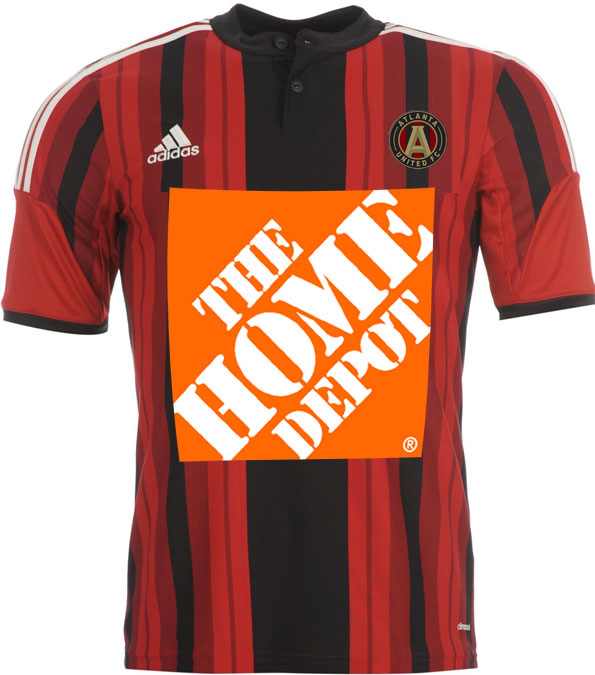
However, the funniest thing about the color palette of the team is the fact that when the day is over, like 90% of soccer uniforms are primarily branded with a corporate sponsor on them. Like, it’s great that Atlanta United FC has a logo of their own, but a betting man knows that it’s absolutely going to be treated with secondary priority whenever the official ATLFC jerseys are unveiled, to a corporate sponsor.
And given the fact that Arthur Blank is among the biggest cheeses of the entire organization, I’d be willing to wager that it’s going to be The Home Depot as the chief sponsor. And I’ve done plenty of The Home Depot work in my career, and I know just how stringent they are with their identity. Despite the fact that the organization’s colors are red, black and gold, we’re going to be treated to a shitshow of a uniform that is going to have The Home Depot’s bright orange smack dab in the middle of it.