
I read this article recently, where a publishing company that produces a ton of annual sporting magazines decided to rank the logos of the SEC. Out of paranoia of sounding like they were full of shit, they turned the reigns over to their in-house graphic designer to compile the list, full of artistic rhetoric and extraneous words to justify ultimately what is a subjective list.
The thing is, the graphic designer went to Ole Miss, and the publication is based out of Tennessee. Both locations are homes to SEC schools, and right then and there, I have no choice but to discount the entire list as garbage due to bias, especially when Tennessee is given the top spot with weak justification; seriously, curled interior angles plus creamsicle orange makes it the best?
So, since I am an ACC guy, don’t really have any vested interest in any SEC football programs, save for the fact that the mythical girlfriend is a South Carolina girl, I think I’m just a little bit more qualified to rank the logos of the SEC. Yes it’s still ultimately a subjective list, but F off, I need something to write about.
From worst to best:

Why is this the worst logo? Because it’s a generic font (Brush Script), and can be recreated by anyone with Microsoft Word. It lacks creativity, effort, and ultimately, I think it’s entirely stupid that the University of Mississippi is better known, officially at that, for a nickname than it’s actual institution’s name. And the fact that it’s called Ole Miss on top of being The Rebels couldn’t pigeon hole the entire school as one that just sounds like it’s full of rednecks who fly the Confederate Flag, especially with the matching palette.

It’s the letter T. With curved interior angles, and primarily in a creamsicle-like shade of orange. But it’s still just the letter T, with minor modifications. It’s boring, mediocre, and kind of indicative of their football program, which is very much lower-middle of the pack. It’s kind of appropriate that the womens basketball program, which the school is primarily known for (link to pat summit in toilet), is more apt to use their own title (Lady Vols), than this boring old letter T.

It’s not that it’s a horrible logo. But the “STATE” ribbon is a little too predominant in the logo as a whole, and it almost entirely covers up M that’s representative of Mississippi. I get that they want to differentiate themselves from the University of Mississippi, but Ole Miss isn’t putting any effort into identifying themselves with the state, so it’s fairly wide open. If it were up to me, I’d have flipped the direction of the banner, arched it downward, and have the M show more and actually looking like an M.

I don’t care how much larger and beveled the T is, I will never not see “ATM” when I look at this logo. And given the way Johnny Manziel springboarded his way from the school to the pros, they basically were his personal ATM.
*I had no idea what the A and M even stood for. Did anyone else? I had to Google it. “Agriculturual and Mechanical.”

I often forget that Vanderbilt is even in the SEC. They’re pretty mediocre at every sport, save for the fact that they generate some good baseball pitchers, but much like their familiarity within athletics, their logo is kind of bland as well. The fact that they’re insistent on having the V inside of the star really is limiting, because frankly there’s fewer shapes more restrictive to overall size than a star. In the grand scope of the logo itself, the Vanderbilt V is about 45% of the entire logo, and I guess that’s about as indicative of people’s awareness of the school’s existence when it comes to SEC athletics.
![]()
How original: LSU’s logo is the letters “LSU” in the school’s colors. Sure, it’s vanilla, but when the day is over, such a vanilla idea still results in something superior to five other SEC schools. Okay, one other minor bias I have against LSU is that it’s school colors are my old high school’s school colors. I’ve seen enough purple and gold in my lifetime. That aside, I have objection with the U in LSU, because ultimately a U is supposed to be palindromic, meaning you could flip it horizontally, and it would still read the same way. LSU’s U is not, because the bottom left side of it contains a hard angle. Which ultimately makes it a V.
LSV, guys. gg

A lot of people don’t know the answer to the who used it first debate between the Green Bay Packers and the University of Georgia, but the answer is the Green Bay Packers. By the grace of god, the Packers allow UGA to use their modified version of the Packers logo as the school’s emblem, and both entities make gobs of money slapping their Gs on everything that all their die-hard supporters throw money at. That being said, Georgia is docked severly and end up in the lower half of the rankings, because frankly their logo isn’t really theirs.
*Also shared with barely an NCAA school, Grambling State University in Louisiana

I kind of like Missouri’s logo ultimately, but the problem is the way it’s designed, you kind of have to stare at it for a few seconds to interpret the tiger within the logo. Like, if you turn your head and glance back really quickly, it takes a few seconds for the components of the logo to materialize into the fact that it’s a fierce growling tiger. There’s just something about combining yellows, whites and blacks within a shape that creates this mirage for people of my brain type, much like the Batman logo used to be when I wasn’t expecting to be looking at a Batman logo.

It’s almost hard to believe, that given the general popularity of the color blue, Kentucky is the only school in the SEC to have a logo that’s entirely blue? Regardless, call it results of success, but Kentucky parlayed their school’s basketball successes and exposure into at least having a logo that’s classic, recognizable, and to have a general feel of college royalty about it. Sure, the school kind of sucks at all other sports, but rarely are there schools that really dominate all the major sports. A little squashed, but when their team is always in the AP top-10 in basketball every year, and always a threat to get to the Final Four, nobody’s arguing about logos by then.

The biased writer slated South Carolina as their worst logo, because they decided that it was too busy. “Blurry,” when they present it as a 50×50 pixel icon, no shit. Contrarily, I like the fact that it’s a complex piece of artwork, and if for anything at all, it’s a safe bet that it’s impossible for any other entity to plagiarize without it becoming a major issue if discovered. In a playing field full of generic and vanilla logos and icons for identity, South Carolina stands out, and depending on whom you ask, that’s a good thing.

I don’t really understand what the biased writer meant when she said “animal logos are better when stylized.” What exactly did she have in mind with the Razorback needing to be stylized? Should it be standing upright, while wearing a college sweater, leaning against an A or something? Something chintzy and stupid? Or, Arkansas can leave it as it is, which is an aggressive looking pig, that does the job pretty sufficiently at being able to symbolize the institution without any letters or text at all.

Ignoring the fact that the name “Crimson Tide” can way too easily be twisted into a metaphor for menstration, I don’t have a problem with Alabama’s logo. If anything at all, it’s gone the popular modern “pog” methodology with a simple letter logo, encircled by the official name of the athletics department. Yes, it is very similar to the Atlanta Braves A, but let’s be real here, any actual sports fan (or someone with a brain) is able to identify the “Alabama combover” in a heartbeat, and be able to differentiate.

“The colors in this logo blend too much.” Yes, that’s going to be the case, again, when you’re looking at a 50×50 pixel image. And also one that’s several years obsolete (fact checking!). But the thing is, the colors are very much Florida-y, and the school has done a great deal of building its brand and identity that it’s transcended the need for any words at all. Seeing this logo is unmistakably Florida, and it succeeds in covering all bases in utilizing school colors, and portraying the athletic department’s name and mascot.

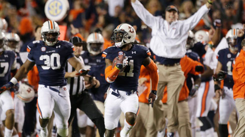
There’s a reason why Auburn hasn’t made any modifications to their logo in over 30 years: they never have had to. It’s a very solid logo that is at the core, just the letters A and U, but presented in an artistic manner that makes it look like an actual artistic logo and not just two stacked letters. It’s palindromic, so it can fly on a flag or banner from either direction without being backward, and it’s not as mundane and boring as the Tennessee T. And having two colors where one of them is not white, adds to why it’s that much superior over Tennessee’s.