
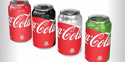
Long story short: Coca-Cola experiencing boost in sales on light and zero-calorie soda in international markets after rolling out new can design for Coke products
My knee-jerk hypothesis is that people see all the red that saturates like 82% of these cans that they don’t realize that they’re purchasing Coke Light (Diet Coke) or Coke Zero until it’s too late, and since merchants typically don’t accept returns on opened containers, they’re just kind of boned and have to deal with it.
Maybe that was Coke’s plan all along.
Who really knows what Coke’s plan ultimately is. There are those who think regular Coke is the devil because they’re solely counting calories. And then there are those who think Diet and Zero are the devil because of sodium and aspartame. This new experimental branding that has only been seen in Spain, Mexico and various parts of Europe seems to accomplishing this confusing effect that still retains each brand’s parent colors, but puts a massive Coke-red blob on all the cans.
In my experiences in consumer marketing, as callous as it is to say, the mentality is to assume that people do not pay attention to details and to make things as obvious as possible (with the underlying idea that people are fucking dumb). These cans kind of defeat that purpose, because they’re forcing consumers to stop and actually examine the cans they’re picking up, lest they end up getting the brand of Coca-Cola that they had not actually intended to consume.
However, if Coke is exploring an idea of “One Brand” as the aforementioned link references, perhaps ambiguity is all part of the plan. Perhaps, it’s leading up to the ultimate of cost-cutting measures, and simplification throughout the product outright.
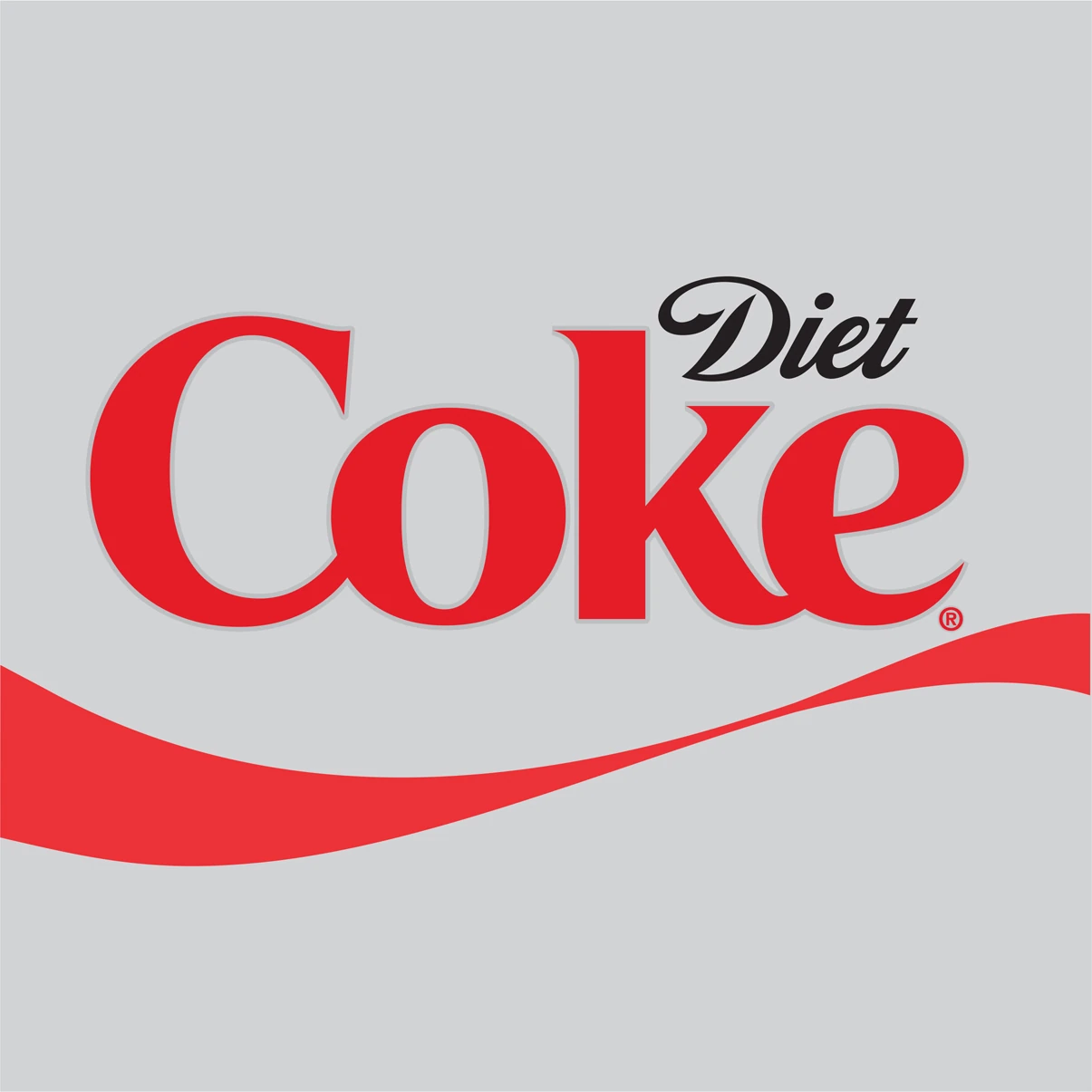
Regardless, as an occasional Diet Coke and its poisonous aspartame drinker, I don’t really feel like I’m going to be affected, unless I go into other countries. The Diet Coke name and brand is so strong in United States, that it would kind of be difficult to integrate it into this kind of look, since the Diet Coke wordmark itself is a logo in itself that’s referred to as the nickname “Coke” and not the proper “Coca-Cola.”
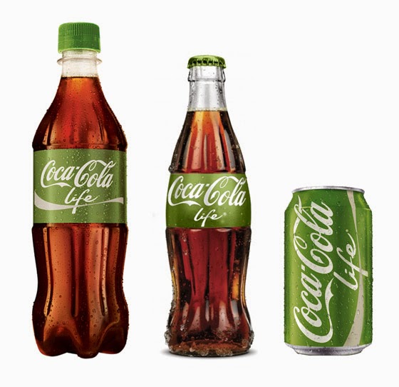
And if one member of the family has to deviate from the “One Brand’ plan, there’s a good chance that it defeats the purpose of the name, and none of them will have to go in this direction in America. Which is fine by me, because I think the green of the Coca-Cola Life is refreshing and pleasing.