
After several years of being denied methods to visit Cleveland and get the home of the Indians off of my list, this past weekend, I managed to parlay some quality father-and-son into a road trip that finally knocked Cleveland off of the list. I now have two ballparks left, before I can say that I’ve visited all 30. But I never would have imagined that Cleveland was going to give me this much trouble.
One of these days, I’ll have a ballpark site again, much less my entire fucking brog, and when that eventually happens, then maybe I’ll get the opportunity to write about the ballpark itself. But for now, the ballpark is not the topic; it’s the team that plays in said ballpark, and their stupid fucking identity.
The Cleveland Indians’ primary emblem is now the letter C. Literally, the letter C. And nothing else. (Mostly) Gone is Chief Wahoo, and even the singular letter I in the stylized script. Because Indians. Because “Indians” is perceived as racist, insensitive and ignorant, or any other popular rhetoric used to describe the blatant and inflammatory discrimination.
Disclaimer: I also believe it is stupid that the media and society have whipped the Washington Redskins into an entity that’s afraid to use its own god damn name. Redskins, Redskins, Redskins. However, I am not of Native American descent, and cannot relate or understand to how they might actually find it offensive. However, I am also not white, enjoying the luxury known as white privilege, and have dealt with my own experiences of discrimination or things that people far more sensitive, might perceive as offensive and inappropriate.
Back to the C, though. Seriously, just look at the logos of the American League. The Cleveland C is without question, undisputedly, the worst logo in the league. It stands out as a blatant symbol of defeat and a lack of creativity. I love how there’s a comparatively large trademark TM next to the C, as if the Cleveland Indians were actually concerned anyone would want to use their singular letter. It’s kind of impossible to not use a capital C, though:
- Christina
- Claire
- Charles
- Christopher
- Chicago
- Cincinnati
- ©
The point is, declaring a capital letter C as the team logo is about as sad as it comes. It’s not like the Cleveland Indians were called something more derogatory like “Cleveland Firewater Drunkards” or “Cleveland Casino Owners;” they were called exactly what they are: Indians.
Unless the objection was over the fact that the phrase “Native American” has become the more PC descriptor, but I have to admit that it would be pretty hilarious if the city of Cleveland doubled-down, imported in a massive number of people from the country of India to work IT and in medical, and then kept the Indians name as literal.
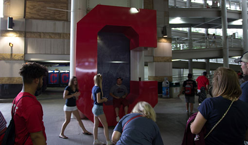
What blows my mind is that people in Cleveland actually like the letter C. To the point where there’s a gigantic statue of a letter C in Progressive Field that fans actually wait in lines, to get the opportunity to take a picture with. A letter C. A fucking 20’ foot tall capital letter C.
I’d rather have a picture taken with a super-offensive Chief Wahoo statue; at least there’s some personality there, offensive as some might think it was. Even better, it was because of this trip to Cleveland, did I discover an alternative Indians logo, in the team’s history.
Honestly, the 1947-1950 logo would’ve been way more offensive than the traditional Chief Wahoo that most baseball fans are innately aware of existing. This is like a Matt Groening-like caricature of an American Indian. This is like 1940s cartoons, where black people are stylized to be as dark and moronic as possible-bad.
And this logo was all over the place, in Progressive Field. Confusingly, the ballpark itself was selling shirts with this logo, like, right down the row of other crappy Indians merch, featuring the lame capital C.
Now that I think about it, maybe they’re pushing this retro caricature of a logo so much, so that regular, red-skinned Chief Wahoo doesn’t look so bad in comparison. If that’s the case, then that’s kind of a genius tactic. Anything but a fucking plain letter C, but preferably, sticking to good ol’ Chief Wahoo would be the best.