To quote an internet commenter who was quoting any brand consultant:
the best diversion to consistent mediocrity is new branding and messaging.
That being said, you know what that means! A new logo was made for something that didn’t need it! And not only was a new logo created for something that didn’t need it, it also cost $590,000 to “make!”
Man, I am absolutely in the wrong business. I totally need to find a way to get back onto the agency side that somehow has entire cities in their back pockets, to where they can charge over half a million dollars to rip off the Airwalk shoes logo, and then package it in 75 words of fluff and bullshit that could sell water to the ocean. Because I’m pretty sure I could plagiarize one thing a year and be completely satisfied pulling in six figures for doing such and then calling it a year.
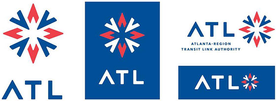
I mean I don’t even know where to begin with this perfect example of federal waste and in all likelihood crooked Atlanta politicians spoon-feeding their bedroom buddies. But I think the most succinct place to start is with just the symbol itself:
- The shapes that form the “star” in the logo are a series of “A’s” – or arrows – that spiral around a central axis, “symbolizing the freedom of movement provided to the region.”
- The arrows point toward and away from the center, “creating pulse-like movement.”
- The shape is reminiscent of a star, “and stars have provided guidance to travelers for thousands of years.”
It’s more like the red arrows form the symbolic shape of the asshole of the collective taxpayers, and the blue arrows represent the collective dicks that are fucking it. The arrows pointing towards and away are pretty appropriate, because the red arrows are the asshole being stretched away, while the blue arrows are most definitely pointed towards the metaphorical fucking they’re doing to our dollars.
Otherwise this is, like most cases of new branding, a complete and utter waste of money. Naturally, the city has zero intention of rolling this out immediately, since slapping vinyl graphics all over buses also costs money, not to mention they don’t want to have to pay off the litany of injury attorneys and DUI lawyers who have the ad space on the vast majority of buses around the city who have probably sunk a lot of money themselves for their ad space, so it’s going to be a minute before this actually officially rolls out.
But in the meantime, they’ll hybridize the logo, and despite the fact that they have their own “meticulously” chosen color palettes, they’ll probably have to be neutered further, so they’ll be cohesive with the various other regional transit agencies as well as MARTA itself. So, taxpayers can look forward to footing the cost of adding stickers to existing buses, and then be on the hook later on, when they’re taken offline for a minute so that they can be completely re-christened as ATL vehicles.
And naturally, by the time comes around, the city will probably have another new logo ready to unveil, that probably will have cost the city another $750,000 to “conceptualize” if we factor in inflation and egregious bonuses that they’ll inevitably sink.
Maybe by then, the base of the T in ATL will be sinking into the asshole, and with the growing fetish of digital artwork, it can be animated to be going in and out of it; y’know, to show that directional motion that they’re claiming is so important.
