
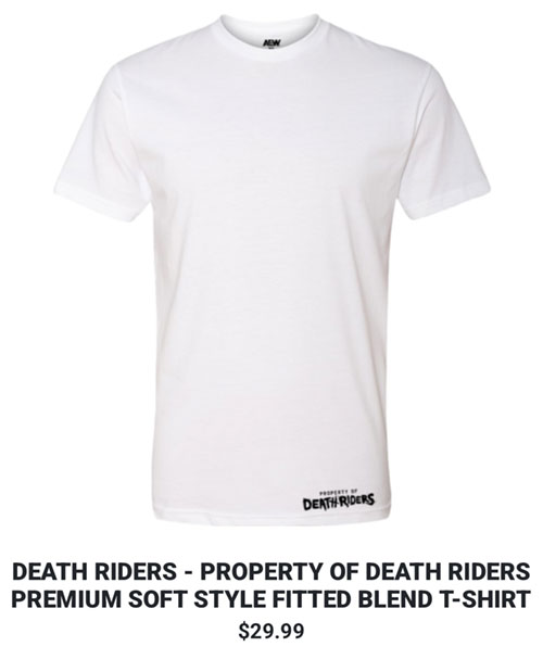
 When I first saw this shirt, I thought it was a joke, a bad photoshop from some shitty wrestling shitposting meme account or something. But nope, it’s very much real, and actually available to you for the low, low price of $29.99 plus tax and shipping, which means it’s basically a plain white t-shirt for somewhere just under $40.
Of course I know that there are all sorts of brand name designers out there who have been peddling plain white t-shirts for upwards of $100+, but they’re often times players in the egregious fashion industry, whom most of them have earned the right to hawk their shitty wares for exorbitant prices, and people not smart enough to realize that they’re being fleeced will actually buy them. But yeah, them, they’re not a professional wrestling promotion, whom most equate their product and their merchandise as tantamount to carny shit, and only exist at that price range solely on the basis of inflation.
Yes, I can see the Property of the Death Riders wordmark on them, anyone (with a magnifying glass) can see it, but the point remains is that AEW’s merch team has basically posted up the absolute bare minimum effort in an actual product available to the public.
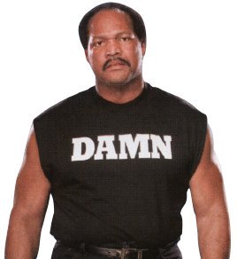
In the past, I’ve called out other bullshit cash grab products like Faarooq’s DAMN shirt which is basically just the word DAMN written on the chest in Rockwell Bold, and the B-Team’s signature shirt, which was obviously deliberately shittily made to help sell the fact that Axel and Bo were B-tier talents, but still turned into a screen print and peddled for $30 a pop (plus tax and shipping).
Well, Property of the Death Riders joins that club of some of the worst wrestling shirts in history, without any question at all. Like, I’m becoming desensitized to a lot of the weird and silly shit that AEW does that I have a hard time grasping because I grew up with the WWE, but to offer up a plain white shirt with the tiniest of logos as an actual product definitely stands out in a sea of weird and silly shit, at least in my mind.
Here’s the funny thing though, as I’m typing this out, there’s a part of me that actually does admire the fact that in spite of the overall bullshit this shirt really is, as far as utility and being able to wear it out in public outside of wrestling shows or flaunting fandom, this shirt actually probably a GOAT. Being a plain white t-shirt, it’s a perfect undershirt, and the lack of any design whatsoever on it means that there’s zero concern of any design being visible behind an opaque white dress shirt. And 10 times out of 10, whenever I’d be wearing a plain white t-shirt, it’s tucked into dress pants, and the dorky little Death Riders wordmark wouldn’t be a factor at all.
But I’m not really fan of white t-shirts in general, because white fabric is like this ticking time bomb where they’ll slowly turn yellow from absolutely no other reason than existing, and any exposure to air, water, moisture accelerates it, and even more so when exposed to human oils or perspiration. I literally had a few white tees that were still in their Ziploc bags, completely unopened and unworn, and when the day came where I felt the need for one, and ripped open the sack, it was yep, yellowed with age.
White t-shirts are basically for weddings and funerals, or any other instances where I’d need a specifically white t-shirt underneath a more priority garment.
Back to the Death Riders white shirt, the jokes just write themselves, as far AEW’s fanbase is concerned. The schlubs who will be willing to plunk down the cash to get these bad boys don’t have to worry about them yellowing from age, because they’ll rapidly turn from the sweat, nacho cheese from Daily’s Place, and vape juice they’ll be exposed to, accelerated whenever they see Toni Storm, Harley Cameron or Skye Blue.
All these observations, without even having to even scratch the surface of what failure the whole Death Riders faction has turned into, because when they formed, they had a ton of momentum, but as is often the case with Tony Khan booking, there’s no focus, no end game or no execution, and all members of the group have been swirling around doing dick and butt for weeks, with no end in sight.
It really is incredible how Jon Moxley in NJPW took his Death Rider persona and absolutely slayed over there, but bringing the name to AEW and making it a group has been absolute death to the brand and identity of it completely.
And I don’t really get it either, the whole white t-shirt thing was Bryan Danielson’s, and the Death Riders basically smothered him and killed his career, and suddenly Mox picks up the whole white shirt thing, acting like a jacked psychotic Andrew WK or something?
As the subject of these posts goes, jesus, wtf?

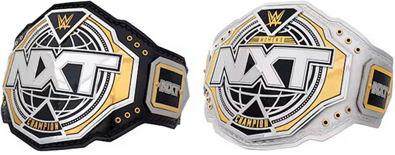
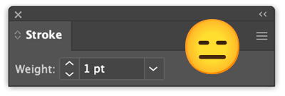 Well, this is a prime example of why I, and other designers end up the way we do, is when we hear about the richest companies on the planet, dumping millions of dollars into rebranding efforts, that in this case are literally taking their old logo and adding 1-2 points of stroke around it, and then calling it rebrand.