Here’s the thing, this article came up in my routine searches for #TRYHARDs to write about, about how Duke’s acceptance rate has hit an all-time low, where only 3.67% of applicants get accepted. I mean, sports bias and perception bias on account of sports, aside, Duke is a fine educational institution, and the name holds a tremendous amount of weight in the world for those who have gone there, and graduated from the university.
But even outside of the world of sport, the Duke brand holds an abysmal reputation and is generally reviled by pretty much everyone except those people who have gone to Duke, graduated from Duke, or financially supported by someone who went to Duke. There’s a general reputation that Duke is snooty, white-bred, arrogant, insufferable and all sorts of pejoratives meant to demean Duke, but it never really mattered, because all the people who are pro-Duke exist on some sort of weird island where nobody else seems to matter.
Which is why it seems so appropriate and fitting that Duke has seemingly decided to gatekeep to a new career high, accepting fewer students than they’ve ever done, and I have to feel that such is probably surprising to absolutely nobody at all, considering their general reputation and the political climate that’s emboldened racists to let their bigot flags fly high and proudly.
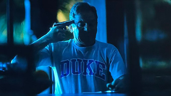
Why I decided to start a post about it is completely beyond me considering I don’t really have much else to say about the topic, but in all honesty the reason I wanted to, was so I could post a screen grab of White Lotus S3, where the character Timothy Ratliff, played by Jason Isaacs is basically losing his marbles, but every time he goes into one of his suicidal fantasies, he’s always wearing a t-shirt with a huge-ass DUKE wordmark on it.
After the last episode, I remarked to mythical wife that I’m sure Duke is (facetiously) thrilled to see their school’s name on the shirt of a criminal embezzler who is becoming suicidal, and as someone who enjoys seeing Duke fail in any capacity, it brings me great amusement to see it happening in the show.
And the funniest thing is that my hypothesis was proven correct when searching for an adequate screen grab to pair with this post, and Googling “Tim Ratliff White Lo-“ auto fills in the rest of “tim ratliff white lotus duke shirt” and all sorts of articles and spot-on screen caps of Tim Ratliff with a gun to his head with his DUKE shirt on are immediately returned, and there are numerous articles detailing the university’s general displeasure at the show that a Duke man is both a criminal and suicidal.
But yeah, I’m not surprised that Duke’s not happy about it, because the Ratliff family is proudly North Carolinian, and boasts how dad is Duke, mom is UNC, eldest son is Duke, I don’t remember which Piper went to, but how Lochte is still deciding between the two, but it’s clear that those who were Dookies are clearly vapid unhinged white people, with one of them becoming suicidal. And I love the validation of my off-remark hypothesis.
So at this point, I have no choice but to continue on with making this post, because it succeeds at taking shots at Duke, as well as put over White Lotus as a show, because season 3 has been entertaining and has demonstrated HBO’s ability to get something that isn’t Game of Thrones or Games of Thrones-adjacent in order to anchor down that Sunday at 9 pm time slot.

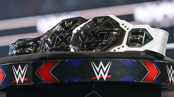
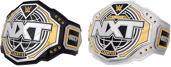
 Well, this is a prime example of why I, and other designers end up the way we do, is when we hear about the richest companies on the planet, dumping millions of dollars into rebranding efforts, that in this case are literally taking their old logo and adding 1-2 points of stroke around it, and then calling it rebrand.