
Source: based on 2010 census data, an interactive map was created that displays a dot for every single person that participated, which is color-coded to what they entered as their ethnicity. The result is what is being called the most comprehensive racial map ever created.
I have to say that this thing is really cool to tinker around with. I don’t hide the fact that my interest is often piqued at the topic of race; some of it happens to do with the fact that despite my American upbringing, my Korean heritage technically makes me a minority, and then there’s the fact that I live in Atlanta, where in spite of the general perceived progression of the rest of the world, is a place where the topic of race and inequality is still a topic on almost a daily basis. The race card is still flung around here like Gambit credit cards, in a far-fetched stretch to incorporate this analogy.
Needless to say, it’s really interesting to zoom in and out of the places of the United States, to see just how they break down, racially. Many stereotypical beliefs about particular places are justified, and then there are a few places where it’s surprising to see congregations of particular ethnicities that you may or may not have known even existed in certain areas.
Naturally, my focus goes to places where I live(d), and places I either visit often, were fond of, or would even consider residing in, in the future as well. In the cases of current/past residences, some things are no surprise, but perplexing is the stumbling across an oddly concentrated chunk of a particular ethnicity in a location one might not have expected to see.
Obviously, this map isn’t without a large margin of error; after all, it’s a known fact that there are plenty of people out there that either don’t fill out their Census survey, and/or dismiss it as a piece of spam mail, and whether people want to believe it or not, there’s still countless numbers of people residing illegally within the United States, all over the place.
What seems suspicious to me is the precariously low ratio of brown dots; which are representative of people who do not fall into the “big 4” categories of white, black, Asian or Hispanic. Native Americans, Middle Easterners and since they’re so insistent on being their own class from the rest of Asia, Pacific Islanders, should all be showing up as brown dots on this map, but there is a questionably low number of them; even in Hawaii.
Regardless, it’s still interesting to me to see the great racial divides in such a comprehensive visual format. One of the things that stands out the most to me is the visual justification of the belief that white people build cities, abandon cities, and watch from the suburbs as they’re taken over by blacks. Also known as white flight, this map shows pretty clearly, that all across the country, most metropolitan areas, or even notably towns and cities themselves, are often times little green (the color designating blacks) clusters, surrounded by these giant halos of blue (color for white people).
Zooming out entirely shows that in spite of the redneck paranoia that blacks are taking over the country, if the United States were to go into a racial war, then apparently white people outnumber black people, much less everyone else, combined, at least three times over. Not much disparity for black domination there just yet.
One of the biggest surprises for me was the suffocating Asian density located in San Francisco. When I went there, sure, I saw my fair share of Asians, and I knew there were lots of Asians there, but I didn’t realize it was to the magnitude of what’s viewable on this map. If I had to guess, I would have pegged Los Angeles, and even Seattle, to have been more crawling with Asians than San Francisco; and in all fairness LA might have SF beat in terms of volume, but certainly not density.
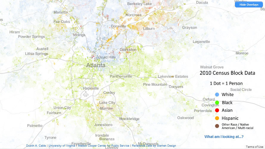
On the flip side, one of least surprising things about this map was none other than home-sweet-home. Atlanta. Can’t really be that surprised about anything, consider this is where I’ve lived for the last eleven years now.
There are common perceptions about the varying regions of the Metro Atlanta area, and how they break down racially. The interactive map gives credence to almost all of it, like the massive concentration of Asians that populate Georgia Tech, the great white flight into North Fulton County, the suffocating Hispanic presence all throughout Buford Highway, “Chambodia,” and of course, the overwhelming notion that Atlanta is a predominantly black city.
It is funny to see how drastic some of the dividing lines actually are in Atlanta; where it’s evidently clear that the west, south, and southeast parts of the perimeter are pretty much completely black neighborhoods, you can see where the largest area of attempted gentrification is taking place. Memorial Drive is more or less the equivalent to 8 Mile Road out in Detroit, but it’s the space in between Memorial and US-278 where it’s a mixing bowl of blacks and whites, before crossing beyond the north part of US-278, where it becomes predominantly white.
What is surprising about Atlanta though is just how predominantly black it actually is, especially in comparison to other cities across the country. From a cursory glance, there doesn’t appear to be any major market or region that’s nearly as densely saturated with a black population like Atlanta is. Even reputably black cities like Baltimore and Detroit don’t compare to Atlanta, and in spite of the gentrification of Southeast Washington D.C., I would place them as the #2 blackest region in the country; behind Atlanta, the blackest city in ‘Murica.
I mean seriously, look at the map. All that green, and how it’s pretty much enveloped the entire city, starting from the south, moving north. It almost looks like a piranha plant from Super Mario Bros.
One last surprise was that I located my neighborhood on the map; the perception of being 97% black is pretty justified based on the map, but what’s alarming is the fact that there’s apparently more than one red dot in my neighborhood. Red dots mean Asians, and I was convinced that I was pretty much the only Asian person in my entire zip code. But apparently, there are like 3-4 other Asians in my own neighborhood that I’m completely unaware of. I sure as shit haven’t seen them, so I guess they’re complete recluses.
Either way, this interactive map is pretty awesome in general, and I’d implore anyone to give it a gander, if this kind of stuff interests you.