As if Vanderbilt had a hard enough time existing in the SEC

Impetus: Vanderbilt changes their logo to their athletic department; impresses nobody

A long time ago I saw some quote that I never really committed to memory, but the gist of it is something that always stuck with me.  It went something along the lines of, there’s few better ways to hide mediocrity than stashing it behind a new logo and branding.

When it comes to college athletics, Vanderbilt is pretty mediocre.  They suck at football, they suck at basketball, and they’re occasionally good at baseball, but college baseball has a level of parity that most other sports wish they had, so it’s not really saying that much.  What doesn’t help is that Vandy is part of the SEC which is obviously the biggest football conference in the country, and they’re also not that terrible at basketball either.  So they’re mediocre at just about everything, but also in one of the most competitive athletic conferences out there.

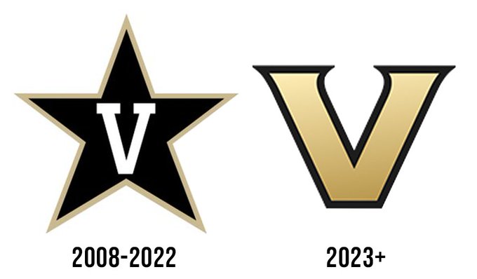
But as far as logos are concerned, I had to give it to Vandy’s old logo, for standing out.  Sure it was just a letter V inside of a silhouette of a star, but there really weren’t many other teams or identities out there that were similar.  No interlocking letters, no script fonts, no abstract bullshit, just a letter V inside of a star.  They came before the Houston Astros rebranded, so they had a lock on that concept first too.

It wasn’t my favorite logo out there, but it was identifiable, and one of the more noteworthy things about Vanderbilt athletics in general.

But then for whatever reason, they decided to change it up, and in a horrific, downgrading manner.  They basically have turned into a generic high school logo, with their plain old V, with some instances of it having a thick stroke, and others having a slight bevel in the center.

It reminds me of playing a video game where someone makes their own team in an established league, but custom teams only have a selection of generic letters to choose from, so someone made the Valdosta or Vinci, and they have this boring looking V on the marquee going up against the Chicago Bulls.

The link above has a lot of the initial greatest hits of internet snark and armchair comedians sharing their takes on the new logo, and there’s really not much else that I can add to it, plus I’m too lazy to write stupidly long-drawn out posts anymore.

What really spurned me to post something at all, was the claims that this new logo was two years in the making, and came after extensive research:

Updates on the Vanderbilt identity come after extensive input from across the community, with more than 500 completed surveys, 70-plus one-on-one interviews and dozens of workshops and group engagement sessions conducted during the past two years.

Yeah, that’s all bullshit.  Either Vandy is lying about how it really took two minutes to come up with such an unoriginal and boring concept, or this is a textbook example of overthinking and overplanning something into oblivion.  By adding as many cooks into the kitchen as 500 surveys and 70+ interviews and workshops and focus groups, every person who thinks they’re an artist or a designer chips more and more away at something with potential, until it turns into this new Vanderbilt V logo.  I do a lot of surveys; I’m a Senior Manager of IT for a Fortune 50 company if it helps me get $1.58, I’m sure I’d be a fan of a boring generic V too if the price were right.

When the day is over, it doesn’t really fucking matter and is more something for me to write about, being the logo and design snob I can be.  Vanderbilt is kind of the definition of mediocrity, but now they have the perfect logo to help visually exemplify their position in the collegiate ranks.

WTF is Capcom thinking with Street Fighter 6’s logo?

When I started seeing people posting about the recent Street Fighter 6 teaser, the very first thing I thought was that it was a fake and/or a joke, because there’s no way that this was going to be the logo for one of the most iconic franchises in video game history.

Ohhh, but it turned out that it really is.

Honestly, I couldn’t give two shits about the game itself, I’ve been so long out of video games in general, much less Street Fighter, that there’s a very high probability that I’ll never even play it in my lifetime.  I never played SFV once, and I only played SFIV a handful of times before I got pissed about there being a quick released SFIV champion hyper turbo or whatever new edition that made my version obsolete, so I never played it again.

But that doesn’t change the fact that I can’t sit on my pedestal and judge logos.  And SF6’s logo is fuckin’ godawful, and it really makes me wonder just what the fuck Capcom is thinking when they phoned it in and “designed’ this shitty piece of clipart and decided it to let it represent the franchise that basically made them who they are today.

I couldn’t even get home from work to point out how turrible the logo is before other sites had already sunken their teeth into the same observation, and a few have already gone as far as to call out the obvious low-effort low-key plagiarism Capcom has done in creating this “logo” that basically says all the same things that I would say.

Seriously though, this isn’t just another case of resisting change for the sake of resisting it.  Street Fighter’s general wordmark has been recognizable and iconic throughout every iteration of the series, and there are common elements and a color palette that continuously make it work no matter the number of sequels they put out.  The gritty, violent-looking delivery of brush strokes to create the words, to the signature yellow-to-orange gradient palettes used in every iteration up to SFV.

And then SF6 phones it in with this lame rip off of some Adobe clipart, and then typing out “Street Fighter” in a jersey typeface that appears to have been modified slightly so they don’t get sued to oblivion by the original font creator.  It’s a sad and insulting edition to an iconic franchise that doesn’t look like it’s real, but it is.

I know I already said that the likelihood of me ever playing SF6 isn’t very high, but I most certainly judge books by their covers, and seeing what is becoming of Street Fighter from the logo alone, would probably give me pause to give it a whirl, even if I were still avidly gaming.

This should mean war

I heard from one of my new colleagues about this, and I had to google it to try and see with my own eyes, because I hardly leave my house in the first place.  Fortunately, photo evidence of it exists, and yeah, it’s everything that was described to me, and I’m pretty much in awe.

Basically, Bojangles has decided that they give no fucks about copyright or decorum, and has erected this giant billboard off of I-75 that flagrantly uses lightly modified versions of the Chick Fil-A mascot cows as well as the Chick Fil-A typeface, in order to push awareness of their supposed new chicken sandwich. 

Which is funny to me, considering I would’ve figured they’ve had one for the last three decades, considering they’re a chicken joint, and they could just as easily take the slabs of chicken used in the cajun filet biscuits that I get exclusively, slap them in between an actual bun with some sauce and pickles, and call it a signature sandwich.  Or maybe they have, and are just releasing something a little in competition to all the other chicken joints’ signature chicken sandwiches, who really knows.

Anyway, this is somewhat notable considering Atlanta is the home of Chick Fil-A, so Bojangles marching into the metro area and propping up a billboard like this really should be a declaration of war to some degree.  But as entertaining as it would be to see an actual war brew between fast food chicken joints, we obviously won’t see anything as flagrant as this in rebuttal, unfortunately.  And Bojangles probably knows that, which is why they did it, because to the public eye, a shot like this that goes unanswered, is a point for them.

Either way, I hold no ill will towards either company, and I enjoy their products both.  Bo’s biscuits on Sunday mornings is practically a tradition in my household, which is the perfect thing to fill the void when Chick Fil-A is closed.  But Chick Fil-A’s app is the gold standard in which all fast food joints should aspire to be, and a large reason of why I go there as often as I do, as it saves me time and aggravation, two things that are in short order when living the life I do these days, all while amassing reward points for more free shit.

But make no mistake, as far as public score keeping goes, this is a huge point for Bojangles in the supposed Restaurant Chicken Wars™.  It would be nice to see CFA respond, but everyone knows they probably won’t.  At least not in Georgia.  It would be fun to see if they drop some cheeky billboards out in Charlotte, if they already haven’t.

I like everything but the name, part 2

I’ve casually been looking at cars over the last few months, because I have this idea that I’ll be able to trade in my current car for way more than the amount I owe on it, because of this mythical shortage of cars on the market leading to this mythical demand of cars, where dealerships are paying premiums for, and I’ll be able to upgrade to a larger dad-mobile instead of a Fairlady Z.

Somewhere along the lines, I saw this car that I found to be pretty attractive, clearly a Toyota.  At first, I thought it was a Highlander, because I didn’t think there was any reason for them to make something within their own umbrella to compete with the iconic RAV-4, but it did look a little small.  But then I found out the name of this vehicle: the Corolla Cross.

As much as I liked what I saw, this wasn’t a viable option for my future, because it’s no bigger than my current car, and with just a 2.0 liter engine pushing 160 horsies, I really have skepticism over this car’s power to weight ratio, and that Toyota’s obsession with fuel economy might be hurting cars like this that will probably drive like a Ford Fiesta if the motor can’t, well motor enough, to move the vehicle.

But I can still appreciate the design of the vehicle, the general interior and exterior aesthetics that I find pleasing.  Honestly, if this were 2019, there’s a very good chance that I might’ve considered this car when I was in the market for a new one then.

…Except the fact that I would probably taken a pass on it, because of, the name.

Why the fuck does Toyota keep making new, logically pleasant vehicles, but then calling them Corollas?  First, they had the Corolla Hatch, which I thought looked really good and seemed like a great bang for buck starter vehicle/fuel sipper, and now they release this perfectly decent seeming CUV, but then slap Corolla on this one too.

As I stated in the link right above, the name Corolla is indeed synonymous with reliability, fuel economy and being outstanding vehicles, but they’re also synonymous with being boring, vanilla and giving up on life.  Corollas are what you get your kids as their first-ever vehicle, because they’re safe, fuel economic, reliable and cheap, so when they inevitably destroy them, they’ll likely live and you won’t be out a billion dollars.  But they’re also the vehicle you get when you’ve lost everything and you need a car period, but don’t want to go used, because they’re unsafe and unreliable, and then realize that a Corolla is in the exact same budget.

And by slapping Corolla onto a hot hatch or a logical CUV, they’re sandbagging their potential, by associating such unfortunate perceptions onto them, thinking that they’ll be of more benefit than detriment.

Like I said, I have a 0% chance of getting one of these in the first place at my current juncture, but if it were 2019, I most definitely would have passed on the Corolla Cross solely because of the lameness of the name.  I wouldn’t want to tell people that I drove a Corolla Cross, because all they would ever hear is “Corolla” and assume that I’ve given up on the rest of my life seeing as how I am middle aged and not a first-time driver.

I would wish Toyota well with this endeavor, but it does not appear they’re interested in doing the Cross any favors by slapping Corolla on it in the first place.  Poor form.

This could be a good mid-life crisis car, if I weren’t already there

Obviously I don’t have the time to stay on top of car news, much less any real news in the world, my city or even my own community, so I have no idea how long this has been in the works, or how much of not-new news this is.  But I recently saw some photos of the 2023 Nissan Fairlady Z, and I couldn’t help but be very impressed with its aesthetics and think it’s one of the more visually appealing cars I’ve seen in a very long time.

Frankly, I suppose I’m the one becoming out of touch and the world of design is leaving an old like me behind, but I haven’t been impressed with lots of cars of today.  They’re boxy, ugly and turning into space ships as far as I’m concerned, and I am disliking a lot more cars than liking them as they’re being released, supply chain be damned.

But the new Nissan Fairlady, now this is something that’s sleek and classic looking, with just enough touches of modern technology that creates an aesthetically pleasing package that is just enough throwback, but implementing a lot of popular elements of today.

From the front, and the side, it doesn’t look too far off of the current 370Z in terms of silhouette and lines.  Maybe looks a little thinner, which I’m good with because I think the current generation looks too fat, caving into the pathetic fat widening of the citizens of the world today.

But it’s the rear end that catches my attention and makes me take longer looks and show some interest in the vehicle beyond just the first aesthetic glance.  It has a very retro-looking hatch, and I love the taillight cluster that definitely harkens back to the 300ZX that was discontinued in the late 90s.

Yes, if I had to pick, I would probably definitely be an ass man, all about that butt.  And the new Fairlady definitely has one that stops and makes me the meme.

The funny thing is that as a whole, the entire car reminds me more of a classic Nissan 180SX in terms of shape and silhouette, but it has the taillight cluster of a 300ZX.  And given the fact that the front does not have retractable lights, it almost feels like a modern take of the Sil-Eighty that I always dreamed of getting/creating myself.

All this being said, one of the first things I said to myself was that this car could very well be a strong candidate for my inevitable mid-life crisis car.  But then I realized that I’m basically already 40 now, which is the stereotypical age in which men stereotypically start going into them, stereotypically getting a muscle car, and dressing like stereotypical douchebags.

And considering the ages of my children, and the inevitable need for a large dad-mobile, short of me becoming wealthier than I am currently and being able to afford an extra, fuck you car, or be willing to recklessly become car-poor, my mid-life crisis car might have to be pushed back a decade or so, to where this car will probably long be gone, and the used versions of them will be modded to oblivion and be basically worthless.

But I can still appreciate great car design, and fantasize about what ifs.  Maybe I’ll turn back the clock, LARP as Gordon (Liu), the guy in the market for a new car, and go test drive one, just to feel what it feels like and get it out of my system.

Looks cool, but will they perform?

It’s been a while since I really wrote anything about anything other than me being depressed, fatherhood, jobs, sports or wrestling, and if there’s ever a topic that gets me all amped up to write, MARTA would definitely be up there.

When I saw this article about how MARTA unveiled new trains, my knee-jerk reaction was to get my clowning shoes on, because just from the text description alone, I figured that there had to be ample opportunities to get back up on the horse and do some clowning.

Honestly though?  After actually taking the time to read the article and see the proposed designs and functionality of the new trains, I don’t really have that much room for clowning.  Although the face of the trains look like a cross between Daft Punk and like a Cerberus shock trooper from Mass Effect, they still look pretty cool, and I think the dynamic light function to indicate the route they’re on is a cool idea.

The interior of the trains have finally come into the modern era, with their being truly connected trains, and no longer there being physical doors leading to exterior access as beggars traversed from car to car.  There is still a lot of room for error when it comes to if people have specific needs for which car they need to get into because of strollers, bikes, or wheelchairs that will have to have some training applied, but at least it’s a start that the cars are actually going to have some variety and not feel like they’re the leftover train cars from the 1980’s DC Metro.

So as ready as I was to get ready to rip this concept apart, I actually don’t have much fuel to burn.  MARTA’s trains have desperately needed updating for nearly two decades, and it appears that it’s finally happening.  Sure, their stations need a lot of attention too, and the general perception of the service and brand seem irreparable, but finally upgrading the trains is a step in the right direction.

However in spite of the upgrades to the hardware, the real question is going to be if MARTA’s actual performance improves, with new trains?  The trains might be shiny and new, but the people running them, and the people riding them, and the stations they’re stopping in and out of aren’t going to be changing that much, and those are the variables that are going to come into play as far as trains remaining on time, hopefully dependable, and not too much the breeding ground for World Star videos.

If so, great.  If not, then still great for the brog, because it’ll be good fodder seeing photos and videos of these brand new fancy trains in the news, where petty crimes, stupidity and some very Atlanta-centric behavior gets the spotlight all the same.

R.I.P. Braves Minor Leagues

Source: Endeavor Group Holdings purchases nine minor league baseball teams, among them the Atlanta Braves’ AAA, AA and High-A minor league affiliates in Georgia and Mississippi

Since few people other than me really gives two shits about Minor League Baseball, how it works is that scattered all across the country are minor league baseball teams, with wacky names, goofy promotions, and smaller ballparks, who affiliate themselves with the 30 Major League Baseball organizations, where the baseball players of tomorrow work on their game and hopefully grow into useful players for the parent Major League club.

However, in a number of exceptions, there are occasionally some minor league teams, that are outright owned by their parent clubs.  The Yankees, Cubs, Cardinals, Giants are examples of teams that one one or more of their affiliates.  The Braves, own four of their affiliates: Danville (rookie), Rome (High-A), Mississippi (AA) and Gwinnett (AAA).  Presumably, ownership of affiliates grants higher control and micromanagement of these clubs, and probably among the highest of priority is geographical lockdown of clubs, so that they never have to play musical chairs with their minor league clubs for when affiliation contracts expire.

But over the last two years, and most definitely not at all helped by the pandemic, minor league baseball has been in somewhat trouble, as far as its future is concerned.  Even before the pandemic, there was lots of discussion of cutting large swaths of teams from MLB affiliation, and even rejiggering the whole holistic organization of minor league systems.  If I had to guess, money is at the root of all this, considering the mass whistleblowing that had been occurring about how minor league players and personnel make less money than your average McDonald’s worker, and how cogs in a machine that earns billions annually, can allow this to happen. 

All the same though, it appears that the Braves and several other franchises have decided to cut their obligations, even at the potential expense of control, and sell off their minor league affiliates.  Make no mistake, these are entirely financial moves, and if I had to guess, the teams who have sold franchises probably all feel that the future of minor league baseball is too murky and uncertain for them to want to risk carrying the financial obligations of having their own minor league organizations.  By selling them off now, they are basically betting that these teams will more likely suffer mediocre earnings if not outright fail in business, than becoming the next Dayton Dragons and sell out every game for 18 straight years.

The perception is definitely cold and callous, and to a degree sad for baseball fans and purists alike.  No matter what, money controls everything in baseball as it unfortunately influences most everything else in everyday ordinary life.

However, there is very bright and silver lining to this.  I don’t know who Endeavor Group or their slave companies who will ultimately operate these teams are, but now that these minor league franchises are all cut free from their parent organizations, the world is now their oyster when it comes to promoting these squads.

Continue reading “R.I.P. Braves Minor Leagues”