
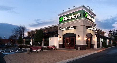
I passed an O’Charley’s restaurant last week while running errands, and I couldn’t help but notice the new logo and identity of the chain. Gone are the soft edges and rounded serifs, and in its place, a text logo that looks like it could it could be typed up in any word processing software in any operating system in existence.
Somewhere out there, in the world of creative, there is an agency that employs a designer that can claim credit for this logo. They can probably give some convoluted explanation to how they came up with what they did, how the all-caps subtitle of “restaurant + bar (note the plus sign, the clear superior alternative to an ampersand)” is done in such a way to emphasize sophistication and seriousness, despite the fact that it’s still an O’Charley’s chain restaurant. They can probably defend that it’s more than just a simple string of text, and how it had to be specially kerned to make it look how it does, how the second apostrophe was shrunk, and how it differs from the first, single-straight quotation mark.
But what they can’t really defend is the fact that in spite of all their explanations and rationales to why the O’Charley’s logo looks the way it does now, it looks like a logo that is for like a financial institution, or maybe tax prep software. It’s probably on account of the green that the new O’Charley’s logo is using, but everything about the new identity screams finance, and not really, food.
Someone actually got paid to make this. Funny how an industry called “creative” so often times goes in a direction that seems to spit out the absolute antithesis of creativity, and succeed.