
In my humble opinion, a logo should mean something. That being said, I do in fact believe that the business world is full of hundreds upon hundreds of “meaningless” logos and identities. If it’s a company’s goal to create a logo that stands out, that’s understandable and justifiable, but when the day is over, there’s still a chance that it’s essentially meaningless; if what’s created doesn’t symbolize anything, then it’s imperfect in my opinion.
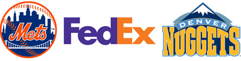
Whenever I think about logos out there, that I think are “great logos,” off the top of my head, the featured above ones stand out. I don’t like the Mets as a team, but damn if I don’t think their logo is a fantastic blend of meaning, symbolism and an aesthetically pleasing color combination. The skyline features symbols of the five New York boroughs, a bridge overlapping them to symbolize connection between them all, the Mets word mark in classic script, all encapsulated within a fairly subtle baseball silhouette.
FedEx seems like a fairly inconspicuous word mark logo, but when the arrow within the E and X in Ex were explained to me, it was one of those can’t not see it anymore moments, which is subtle genius, because the arrow represents the forward progress of shipping logistics.
Continue reading “Logos, selective hearing and non-constructive criticism”