
Can we say, overdesigned?
Recently, I had to renew my driver’s license. Having seen a few people with the new format already, I dreaded doing such, and I had hoped that mine would be sort of grandfathered in some clause stating that I would get the old format, since that’s how my first Georgia license was like. Unfortunately, that did not turn out to be the case, and just the other night, I got in the mail, my new state-issued Georgia driver’s license.
As hard as it is for some people to believe, I am a graphic designer, and therefore I do feel that I have a modicum of authority when it comes to judging the way things look. That being said, I really, really dislike the direction the state of Georgia has gone in their drivers’ licenses. It’s like there was a list of security features they wanted to incorporate which is fine and all, since security is very important when it comes to state-issued identification. But when it came to executing the design of the new licenses, they simply fell, face first onto a steaming pile of failure.
I was really pleased when I got my first Georgia driver’s license. I never really liked the ones of Virginia, especially how they used to do a whole lot of stupid shit, like having portrait-oriented licenses for those under 21, and having a side-view mugshot as your picture, since that is how the cops will see you when they pull you over to write $1,000+ speeding tickets. So I felt it was a step up when I handed in my Virginia license and was issued my Georgia one, way back when.
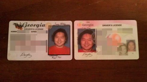
The old Georgia license was simple, classy, basic, and still maintained identity of the state. A nice font for Georgia, instead of the boring, bold-caps Times Roman or Arial that so many other states use on their licenses. A small branch of peaches, indicative of what Georgia’s most widely known for, for a little bit of local association. And basic Century Gothic typeface for all of the pertinent information. Simple. Vanilla. Convenient.
The new one, is simply put an apocalypse of color, bad layout, and orgasm of security features, splattered all about. Now I won’t really question the things done in the name of security, like having my picture three times on the card, as well as my signature twice on it. But the rest of the design is just an abysmal presentation of failure.
Much like the failure that is the City of Atlanta’s logo, for some reason, the entire State of Georgia decided that they needed to have a logo, and therefore one now exists. I’m not sure how many other states in the country actually have official logos, but I can’t help but think that there are definitely better ways to spend tax dollars than fucking logos. But anyway, since a logo exists, it clearly must be a part of the state’s issued identification.
Firstly, we have the pink/peach-ish/green colors completely all over the entire motherfucker, in a gross display of excessive color. This license goes from a fucking 0.0 to a 4.0 if the background color were simply just white. Such considerations would easily make the peach watermark in the background of the information field pop better, and frankly, the logo at the top left corner stand out more, since there’s no color to compete with. But essentially, just like the bearer’s picture, the peach manages to be on the license three times as well. As the background color, the watermark, as well as in the logo.
The information field is a parade of irrationally place floating text, with really no rhyme or reason to why which categories are floating around in which sections of the card. The tracking values are all jacked up, and nothing looks like it belongs anywhere. Even the words “driver’s license” isn’t centered within the text area, and is just kind of floating out in limbo.
But the worst of everything else is probably the fucking logo in general. The name “Georgia” is practically one of the most important components of the identification, so that people can know what state you’re from. But mired in the seas of pinks and peach colors, you can hardly see the name Georgia at all in the top left corner. If anything at all, it looks like the fucking Georgia logo was the very last thing put into the layout, and whomever designed this piece of shit had gone so far overboard with everything else, that they didn’t realize how tiny, disproportionate and illegible the logo actually would be, in the layout. I understand that logo designers want users to use the logo as appropriately as they created them, but in the industry, there are such things allowed as exception. The text “Georgia” needs to be darker, larger, and not constrained by the ratio of the peach graphic – it’s not like there isn’t more than ample space for it to fill up.
Man, I didn’t realize I had this many words to describe my disdain for the current Georgia license. And this doesn’t even factor in the fact that it’s also on a different stock, which is noticeably thinner than the former, and makes it feel more, well, counterfeit and fake.
Georgia’s current license’s grade: F.
Needless to say, my old license technically doesn’t expire until next week. Guess what’s going to be in my wallet until then?