
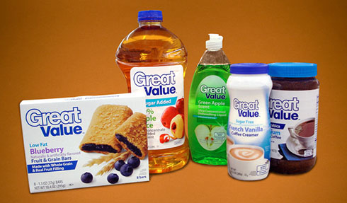
Anyone who’s ever gone inside a Walmart might be familiar with their private label products; the Great Value name that Walmart uses as their store brand. Fairly easily identifiable by the uniformity of white packaging or labels, and their minor variation of colors based on the product.
It’s clean and it’s simple, there’s absolutely no denying that. It’s exactly what Walmart wishes their own brand to appear, despite the fact that their name is synonymous with lower-class America, but I’m straying from the point. For its efforts and objective, the current iteration of the Great Brand identity has won a couple of design awards, and received lots of accolade from the general design community.
It is that part of the story, that I cannot necessarily agree with.
Functional, yes, simple and clean, yes, but it’s also extremely vanilla and boring. Completely. I know the person who essentially made the whole identity, because I freelanced at the agency where it came from. I actually liked the designer herself, and found her and her accent kind of sexy. And she is one hell of a designer, capable of making stuff way more interesting than Walmart’s private label.
But I still am adamant to objecting that the Great Value label is anything remotely close to deserving of any sort of design awards. Not to knock the designer’s work, but mostly in criticism towards the design industry as a whole, which is kind of hypocritical since it’s the design industry in which I’m also a part of as well.
The “logo” is nothing but the words “Great Value” in some typeface that looks a lot like Helvetica Textbook, with reduced kerning, enough to get some of the corners of each letter to slightly overlap, before an offset path is inserted to surround the word “Great.” No matter how much rhetoric is used to describe the arduous process of conceptualizing this “logo,” believe me when I say it would take about 45 seconds to create that look. A little bit more once it’s decided that the word “Value” should be solid, and a different color, for some convoluted reason.
The rest of the identity is defined by the most boring font on the planet, Myriad (Pro) Bold, and an occasional parallelogram with an angled edge to run off of the left margin, with some emphasis text.
From a functionality standpoint, it works great. The general minimalistic nature of the look as a whole affords generous amounts of space for the all-important beauty shots, and because the background is solely white, just about everything can be shot on a white backdrop with very minimal retouching required to make it template-friendly. It is and was meant to be versatile enough to be applied to everything from can labels, boxes to bottles.
But from the design standpoint that I’ve zeroed in on, it’s completely boring, and doesn’t appear to have that much effort put into it. It’s just two fonts, with minimal Illustrator treatments to spruce things up, barely. How this is award winning by any estimation, is completely beyond me, and further makes me question the nature of my own industry sometimes.
By no means is the resulting look and identity the fault of the sexy designer, because ultimately, she does what the client wants, and with Walmart being the sterile, vanilla and nondescript boring company it is, the look and feel of the entire thing is kind of appropriate and fitting. But the fact that it garnered as much attention and accolade as it did makes me wonder if it has more to do with the involvement of a powerful and rich corporation like Walmart being involved, or if the people creating and awarding these accolades are just that pretentious and full of shit.