
I’ve known about this rebrand for a few months now, since being a “gold” customer apparently entitles coffee drinkers like myself a little bit of privy information in regards to what the company is doing. Today, was the first that I’ve seen of the new branding, and I have to wonder, is their brand simply strong enough to go without any wording?
I’m curious to know that with or without the hints, how many people knew that I was talking about Starbucks?
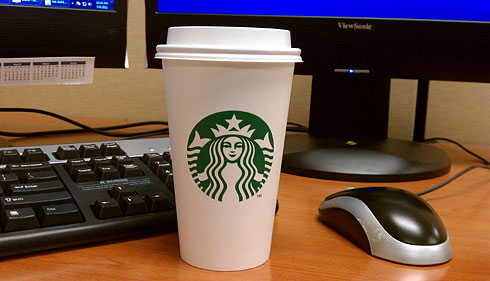
Starbucks is heading down the path of such brands as Nike and Target, and ditching words altogether in their identity. Now I doubt that they’ll do away with words on the buildings themselves, but at least in their most versatile form of advertisement in their cups, they’re taking the bold leap of faith by going wordless.
To be perfectly honest, I’ve never associated Starbucks with the goddess-supposed entity within the green circle surrounded by the text as much as it was the text itself. Simple, sans-serif, in an attractive forest green. And much like the arrow in the FedEx logo, it took me a while to even notice that there was a female in the logo at all.
This could all very well be just me, but I don’t really think Starbucks’, as globally powerful as their product and company is, I simply don’t think their brand is strong enough to go without the wording. Considering the wide varieties in which Starbucks is presented to the consumer; kiosks, within stores, their own standing establishments, all treated with either just text or text+logo, but never the logo by itself.
Nike was around for at least several decades, with several of those decades being a period of time in which no Starbucks existed, before they realized that they didn’t need to put the word “NIKE” on their shoes and clothing any further. They succeeded because of longevity and subsequent saturation of their identity into the market over such long periods of time.
Target is a good example of brand success because of consistency, as well as aggressive, innovative advertising. Consistency lies in the presentation of their product; they are almost always free-standing buildings, the centers of their own attention, all their buildings look similar or alike altogether. There’s never any question to what kind of place you’re going to when you’re looking for, or going to a Target. One of my favorite stories of some tactical marketing was during a holiday season years ago, Target literally bought up the ad space for an entire edition of the Wall Street Journal’s magazine. Literally. In between every story, every article, was a Target ad. Down from the mini half-page ads, the black-and-white filler ads, to the inside cover, to the back cover themselves, were nothing but Target ads. They also never used the word “Target” without the logo being anywhere, constantly reinforcing their brand, and basically pushing it to the point where they simply no longer needed to use the text. Now, we have free-standing Targets, identifiable from eyeshot, by nothing other than the iconic bulls-eye logo.
An interesting success story of branding to me, would be Chili’s restaurants. They succeed, simply by being fortunate to be able to be literal. They’ve also been around for a great deal of time, but if anyone’s seen Chili’s advertising these days, they have gradually phased out the corny, rounded cornered, adjoined text logo that their stores’ signs have been known for the literal, red chili pepper. More recent advertising has displayed URL’s with a literal chili pepper artwork, next to a “.com,” and in their case, it simply makes sense. Nowadays, when I see a red chili pepper, it doesn’t take long for me to be reminded of Chili’s restaurants.
Starbucks, has little of these facets, to where I could think of them as a strong enough brand to go nameless. Their buildings are often different, and not to be too insulting, but about as capable as a McDonalds express, to force themselves into any structure. Too often, their text stands alone, neglecting to reinforce the green goddess logo, preventing it from gaining any steam in the need for recognition.
But they’ve gone ahead and taken the jump regardless. They’ll no doubt be fine, as Starbucks sells a bajillion cups of coffee on any given day, regardless of what their logo(s) look like, but for a marketing graphic designer nerd like myself, I question it regardless. If you ever see a person drinking coffee from a nondescript, nameless white cup, and someone asks what kind of coffee they’re drinking, then I’m clearly not the only one.