
Earlier this week, my office upgraded to CS6. Honestly, I didn’t even realize that CS6 was already here. Nowadays, Adobe doesn’t even wait for the paint to dry on their prior product before shoving the newest one out the door, often times leading to debacles like how awful CS3 was. But the more I think about it, I realize that I first used CS5 products in the tail end of 2010, so for all intents and purposes, CS5 probably had a good, albeit less than two year run, which only makes it feel like time has really flown.
I have a theory that Adobe products are a lot like cars. When a new generation is released, the very first year of it is often the ones where flaws are discovered, recalls are prompted, and for all intents and purposes, are the worst of the eventual generation. When Adobe went from the artistic noir generation of CS1 and CS2, into the periodic table styling introduced in CS3 through CS5, without question CS3 was utter garbage. InDesign being the worst of them all with its endless parade of inexplicable crashes and errors making me rethink my career more than a few times. But by the time CS5 rolled around, most everything was fairly stable, and crossing between software was a fairly harmless process, and business could move as usual.
So far, CS6 hasn’t been too terrible, other than the fact that all of my projects take a few extra moments to open as [Converted] files, but it’s only been three days. This is a first year of a new generation, so I’m sure there are bound to be some inexplicable flaws that will make me want to jump out of a window eventually.
However, with the changing of the generation comes some graphic changes as well, namely the splash screens while the software loads. For some reason, Adobe is trying to go back to the days of when they had fancy, artsy splash screens, but they’re afraid to commit completely, and still have their rectangles and base colors. Regardless, they’re all different, and it’s up to me, to judge them.
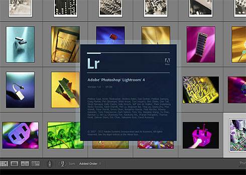
Lightroom (shown above) is the most nondescript one of them all. It’s a square, and it’s nothing special at all. For the record as a program, I love Lightroom, and would love to have it on my personal machine too.
But Lightroom is probably the only normal one of them. Snap judgment time.
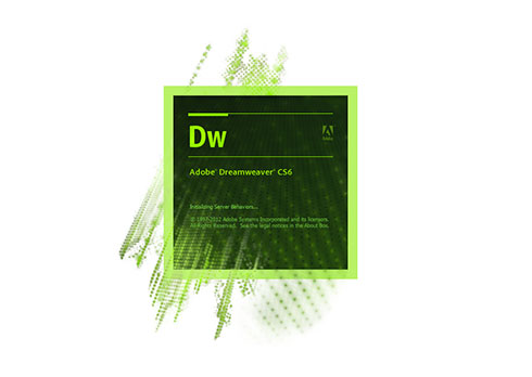
I don’t really use Dreamweaver that much these days, aside from editing my baseball park website, and what I use to write my weekly baseball columns in, since I can knock out all of the minute HTML coding and styling before exporting it directly in code to the website. But for whatever reason, Adobe has decided that Dreamweaver is the Matrix now. Take the fucking blue pill and drop this ugly design.
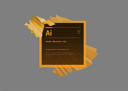
Whenever Illustrator loads, I feel like folding up a paper airplane. And I hear MIA’s Paper Planes in my head at the same time.
DROOOOIIIIIIIDDDDD
It reminds me of when you’re watching cable television, and there is a hiccup or lag in the transmission, and it’s the pixilation of the screen as the picture struggles to recover.
The crown jewel of Adobe has the largest splash screen of them all. Unfortunately, it has the most obscene one of them all as well, giving a new meaning to the letters “CS.” Adobe Photoshop CumShot6 looks just like such. Big blobs of goo plastered erratically all over the splash (get it?) with rivulets and droplets all around.
Once you see it, you’ll probably never be able to un-see it. You’re welcome.