
No, that’s not a typo. In my circles, they have always and will always be known as the Chragers.
Anyway, if you haven’t heard which is very likely because despite my love of sports, like 10% of the people I associate with actually follow them, but the NFL team once known as the San Diego Chragers have announced that they will be moving to Los Angeles.
Back in 1996, the Cleveland Browns were moved to Baltimore, where they became the Baltimore Ravens; they left the Browns name behind, which was convenient for when the NFL expanded again years later, and the Browns were resurrected into the perennial basement. Such was not the case in San Diego, and the entire Chragers brand, identity and personnel are all going up I-5 to LA.
In today’s connected world, it’s nary impossible to unveil a logo that won’t be met with varying degrees of criticism; usually it’s a 60-40 hate it versus love it scale, and typically only goes in a direction where it’s either hated more, or people say “at least it’s not the old Tampa Bay Bucaneers.”
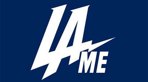
And the Chragers are no exception to this rule, as they unveiled what they’re alleging is “a prototype” “concept”* of their new logo, which is simply the letters “LA” in white over a dark blue background, but with the bottom stroke of the L made to look like a pointy tip of a lightning bolt.
*this is done by all creatives to cover their asses in the event that the hate-love scale skews extremely over like 90 and is hated so much that it has to be changed, but in the vast majority of cases it’s already finalized in spite of the alleged state of development
Now anyone who follows sports, is a logo snob or both like me, would immediately envision the Los Angeles Dodgers logo, based on the description of “LA in white over blue,” and this parallel was obviously not lost on the vast majority of the concerning internet. Also not lost on the internet was the potential for ridicule that the new Chragers logo was subject to, because if there’s one thing that is an absolute must, it’s piling on, to anything that everyone else is having some fun with at the expense of others.
Needless to say, by the time I got wind of the Chragers’ new logo, all the good jokes have already been used, and anything I could have thought of to say had already been said. I’m okay with that, because everyone is a way better comedian than I could hope to be, and by them all putting themselves out there, they’re the ones subjecting themselves to counter-criticism and not me. One of my favorites is the response from the Tampa Bay Lightning NHL team, which took the preemptive strike and owned the joke before they could get bombarded with it even worse, about how the Chragers logo literally looks like the offspring between theirs and the Dodgers’ logos.
Anyway, from a design standpoint, I have to agree with all accusations that the logo was born of laziness. Which then makes the logo lame, which then leads to all people LOLing at it. But yes, the logo is lazy, uncreative, and lacks any potential to actually look good in equipment application.
While the Patriots, Broncos, Cardinals and Buccaneers all have icons and symbols on their helmets, the Chragers will simply have some letters, even if a tiny facet of them is supposed to represent bolts. Additionally, the lack of any accent colors or any trim on the helmet design kind of hints that the corresponding jerseys will literally be pigeon-holed into a scheme of navy and blue. Even the old Chragers of San Diego had two shades of blue they alternated between, and a constant yellow as a primary secondary color to go along with any knockout white they used.
Amazingly, by simply under-designing their initial identity, the LA Chragers have put themselves on a course to where they will somehow manage to be overall worse than the Cleveland Browns, who not only suck at football, but actually manage to exist with zero-design in their identity with completely plain helmets and jerseys and no icon, mascot or wordmark to use at all.
Anyway, it’ll be interesting to see what the Chragers do now, now that their initial attempt at branding has kind of been met with underwhelming results and a high rate of criticism. Will they concede a modicum of failure, go back to the drawing board and try something else, or attempt to integrate the old yellow into the wordmark like it was done in San Diego? Or will they pretend like the chatter doesn’t exist, consider the logo a resounding success and solder forward with a logo that many people think is lazy and lame? Either way, it’s a victory for the snarky internet, who will be looking forward with bated breath to an overblown and overproduced uniform unveiling event, which seems like the next logical step in the move and repackaging of the Chragers of LA.