
Apparently I missed this way back from September: but Major League Baseball and Minor League Baseball have agreed to change the official logo of Minor League Baseball
And of course this wouldn’t be a post if I didn’t, but I absolutely hate it, thanks.
Fewer things are a sign of mediocrity and spinning wheels like a logo rebranding. This was not a case like the Cleveland Indians really needing to get rid of a horrifically racist mascot, this was the case of some bored corporate stooges looking for things that weren’t broken and decided to fix them anyway, to justify their existences.
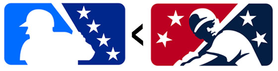
There was absolutely nothing wrong with the previous MiLB logo. It was subtle, it was understandable, and most importantly, it was just different enough to where the shape and brand positioning of it was always consistent to MLB standards, but the visual identity of the icon itself was different enough for those looking to understand that this was Minor League and not the MLB icon that any sports fan or casual could understand.
In one of my favorite pictures I’ve ever taken with my mom, I’m wearing the old MiLB logo generic shirt.
Now this new crappy logo is basically identical to the MLB logo, except the batter is aligned to the left, and instead of a baseball coming towards the batter, it now looks like the batter has sat looking at four pitches that are now past him, and considering the escalating rate of strikeouts throughout the last half-century, the guy in the logo has probably struck-out, as much as the logo itself does in my opinion.
I hate to say it, but there are a lot of baseball fans that aren’t particularly intelligent. The Gwinnett Braves used the excuse that there were people that actually managed to confuse tickets for G-Braves tickets for tickets for the Atlanta Braves, which I didn’t think was really a believable excuse, but I’m also not going to pretend like baseball fans are always the smartest people in the world either. This new logo is going to 100% confuse people into thinking they’re going to Major League games and buying Major League apparel, but perhaps that really is the end game, and I’m just being hyper critical of a tactic that I think is petty, but is really some corporate shills really living in 2050 and playing chess.
And I don’t understand why they’ve put a color palette behind it, especially of two shades of blue. MLB logos, especially on apparel, namely baseball caps, often times already ditch their own color palette and adopt the primary and secondary colors of the team, or they just go reverse white, as not to compete with the colors of the teams, especially ones that don’t utilize the navy and red palette of the MLB logo. This Carolina/Dook blue combo logo just seems odd and uncharacteristic to professional baseball in general, where it seems like the vast majority of teams utilize shades of red, at all levels of the game. For all the teams like the Blue Rocks or the Stone Crabs or the Pelicans that utilize shades of blue, there are teams like the Redbirds, Nuts, Crawdads and much more where adding a logo of blues into their branding is more like shoehorning a horse’s hoof into a toddler’s shoe.
Either way, I am very much not a fan of the new MiLB logo. It is uncreative, homogenized, convoluted, and was something that never needed to be updated in the first place. Not that I’m going to many baseball games at all these days, but a team’s branding is going to have to work just a little bit harder to make me decide to impulsively drop some cash on any team merch if it’s going to have this little blue turd of a brand slapped onto it.
There may be four stars on the logo, but if it were up to me, it would have none.